Consumer service
TIER App
Story
As a member of the TIER Mobility app design team, I was responsible for the design of the sign-up flow in the past year, covering screens from splash to successful sign-up, enabling users to start their first ride. Collaborating closely with my team, I ensured that the sign-up flow was user-friendly and delivered a seamless experience. Through extensive user testing, we identified pain points and areas for improvement, incorporating feedback to refine the design.
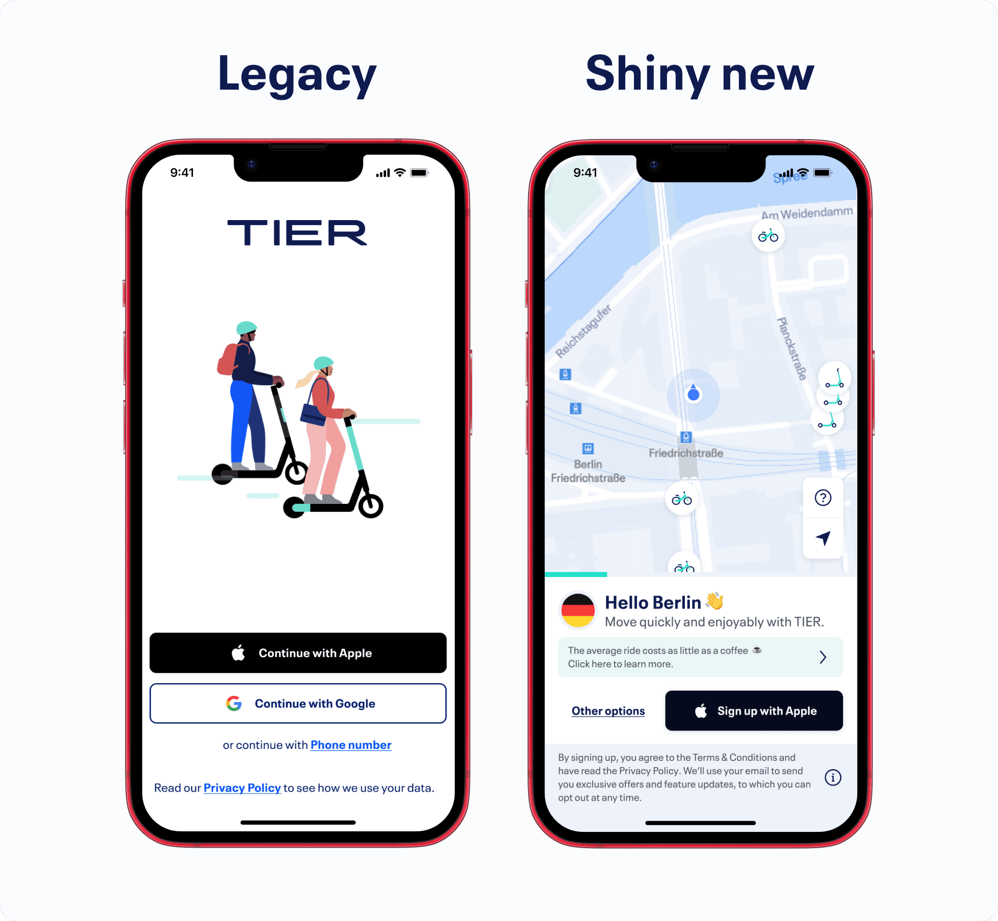
When I joined the team, we already had a legacy solution with platform differences that were not compatible with our design system. We could only conduct experiments and evaluate which variants were more effective for users. We reached the maximum efficiency of the existing solution.
However, over six months ago, we made the decision to rethink the entire process from scratch.
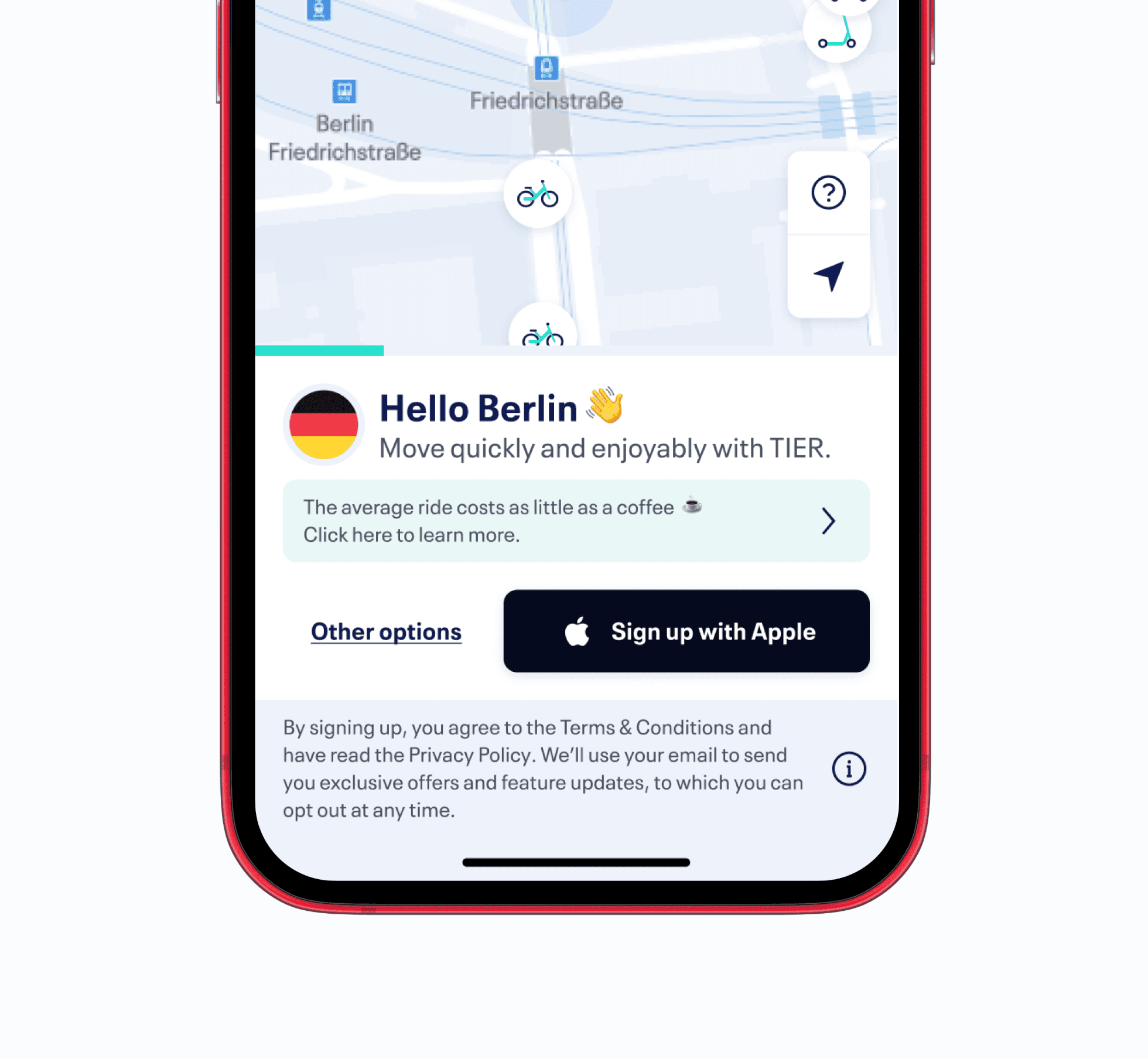
Our goal
Our goal was to provide users with a more efficient, concise, and secure solution that wouldn't overwhelm them with excessive information about the available services before they shared all their data with the system.

Solution by the team
We had access to a wealth of data from our data and research teams. Additionally, our team had numerous ideas, making it essential to gather all this information and shape it somehow. Therefore, within the framework of a one-week design sprint, we conducted several workshops to examine positive and negative factors and create the new user flow.
Solution on design side
By the end of the design sprint, it became clear which fundamental features needed to take priority:
After the splash screen, users could immediately see the map and explore available options in their surroundings.
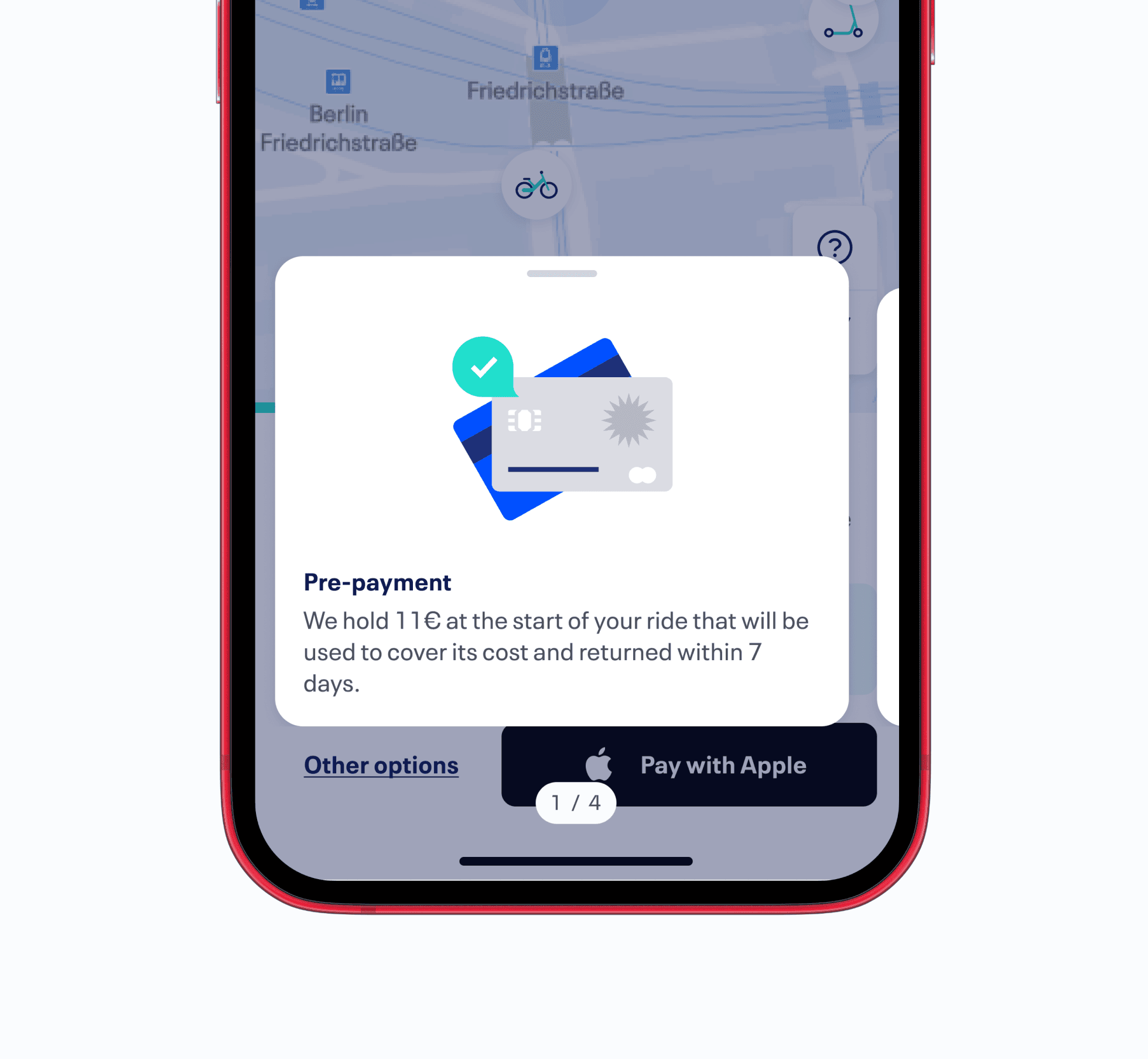
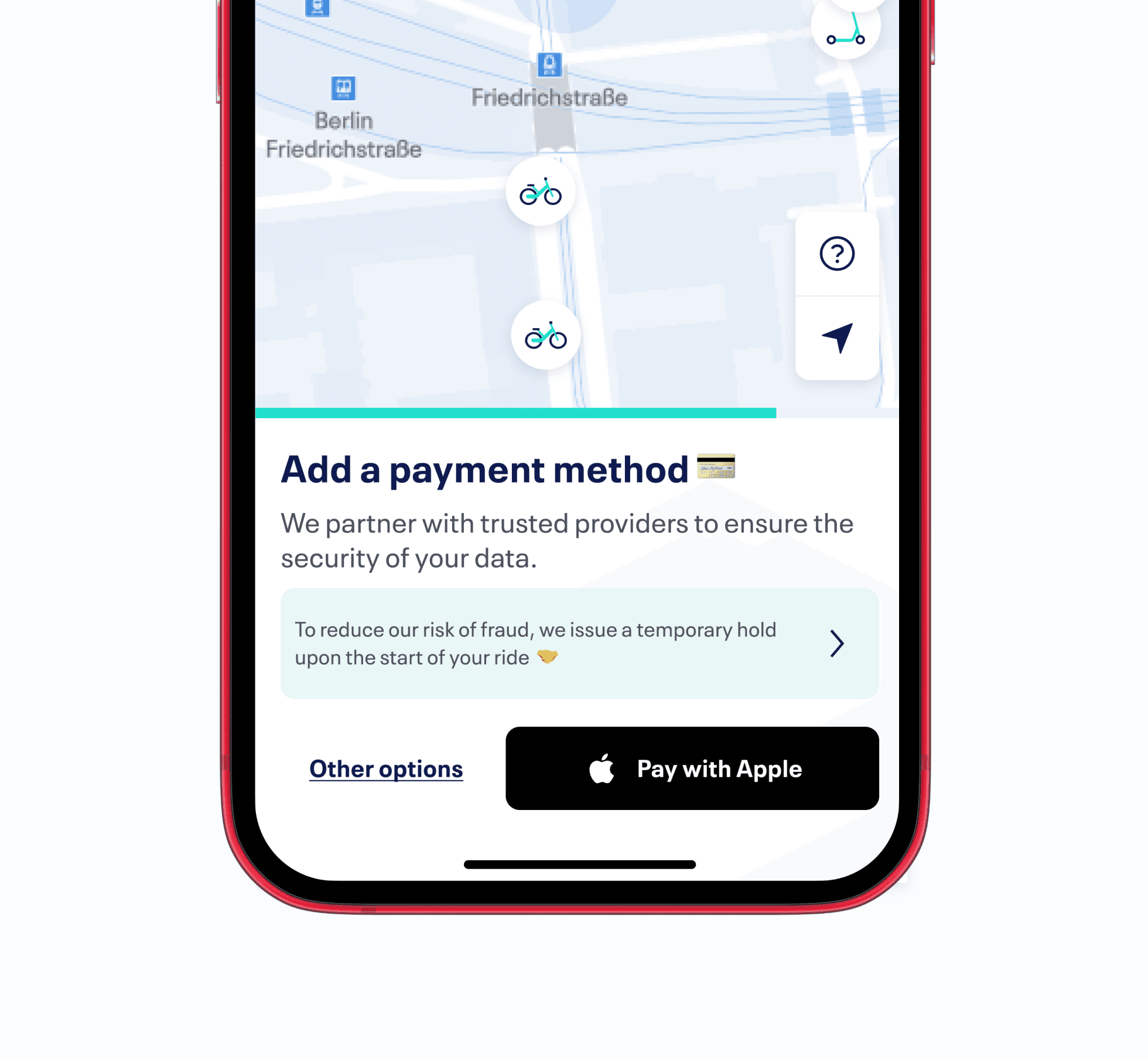
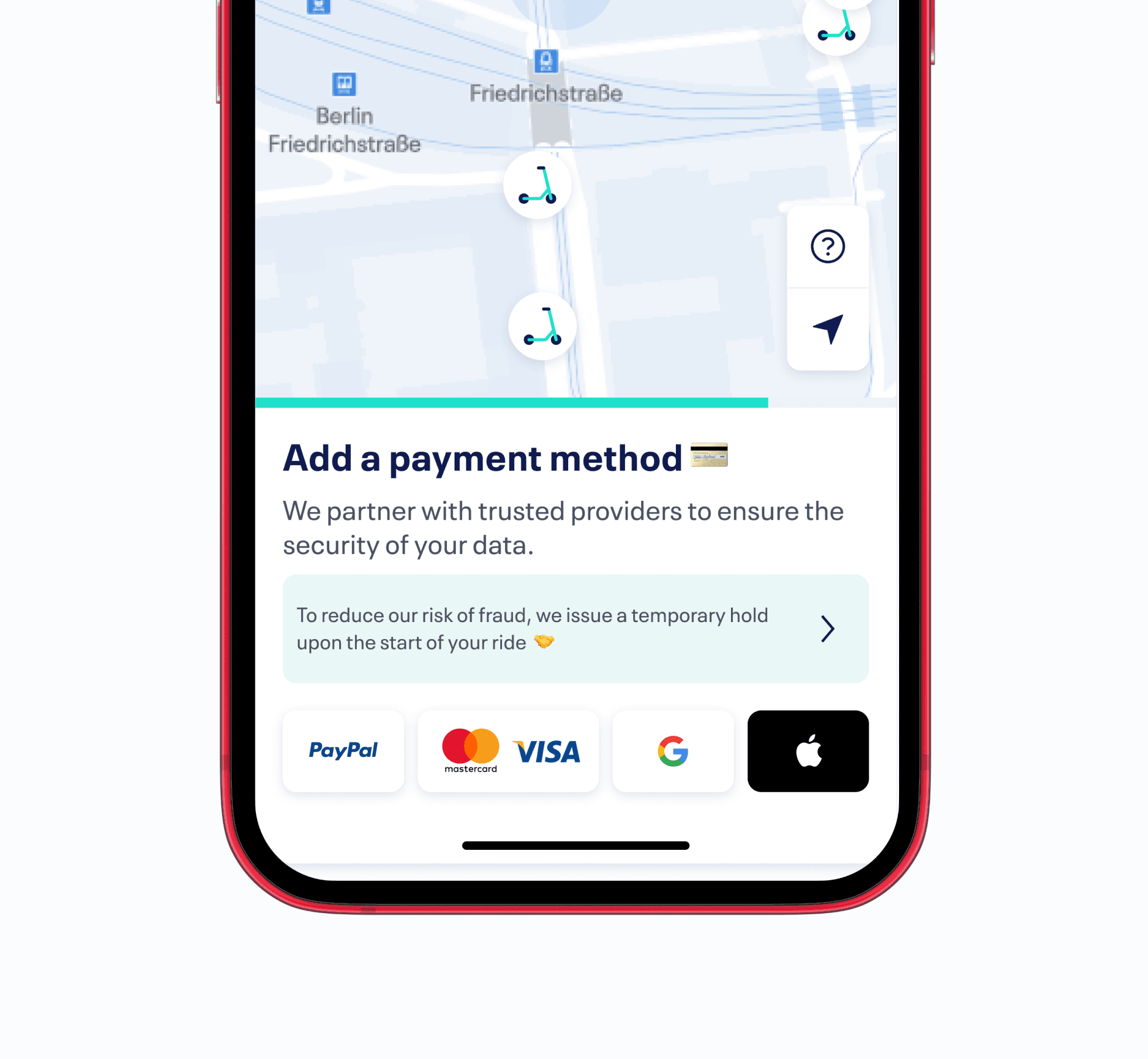
We focused on implementing the fastest sign-up solution, incorporating platform-specific functions for profile creation and payment setup.
We considered that certain cities required unique features, which needed to be integrated into the new flow. Therefore, we strived to place critical features in a way that additional information wouldn't cause confusion during the journey.